Find yourself squinting at your website?
Several weeks ago, Chicago’s Cardinal Francis George passed away. One of the stories going around was about how a local barber came to shave him several times a week.
The barber’s pitch:
“You look like a bum.”
The barber had seen the cardinal on TV, called him up and told him that he needed a better shave. It might seem insulting, but the jab got the prelate’s attention. (The barber, by the way, never charged for his services.)
Your vocations website – a bad shave?
Does your religious website look like a bum? The big question today is, how does your site look on a mobile device? The number of mobile users exceeded those of desktop users about a year and a half ago. More and more people are using mobile devices to browse the web. That includes single Catholics looking for their vocation in life.
Are you being left in the dust?
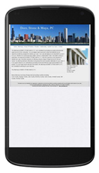
Google’s mobile-friendly test shows the above image of a website of a Chicago law firm on a smart phone. You would need a magnifying glass and a lot of patience to read it. Put your own web address there and see what it looks like.
The one-page wonder
Just a few days ago our team at TreeFrogClick launched a new type of website called a one-page site. It’s at RestoreAmericanLiberty. This style of site has only one, very long page. It is designed to showcase one theme or idea. My guess is that scrolling down is easier than clicking from one tab to another – especially on a smart phone.
The long page is a form of what is called long-copy advertising in the marketing world.
And the graphics are astounding. You can have big-screen images that remain stationery while the text scrolls by – like the credits on a movie screen.
Would you like a one-page website to enhance your vocations website? Or maybe a conventional site of many pages that is truly mobile responsive? Contact us and we can talk about how it can be done.
